|
|
Post by legios on Aug 25, 2011 22:20:36 GMT
Such images of might
are great to see tonight.
Karl
|
|
|
|
Post by Benn on Aug 28, 2011 14:04:44 GMT
Thank you my friends!
Hopefully my art, it never ends!
|
|
|
|
Post by Andy Turnbull on Aug 28, 2011 20:43:43 GMT
These images are of such quality they drive to implore,
Don't stop now, we need more, more!
Andy
|
|
|
|
Post by Benn on Jan 17, 2012 19:25:20 GMT
Been a while, so... Nothing new for those of you who watch my dA pages, but... The rest of you deserve pain also! 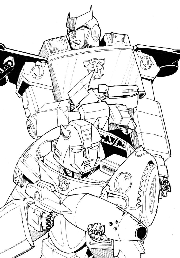 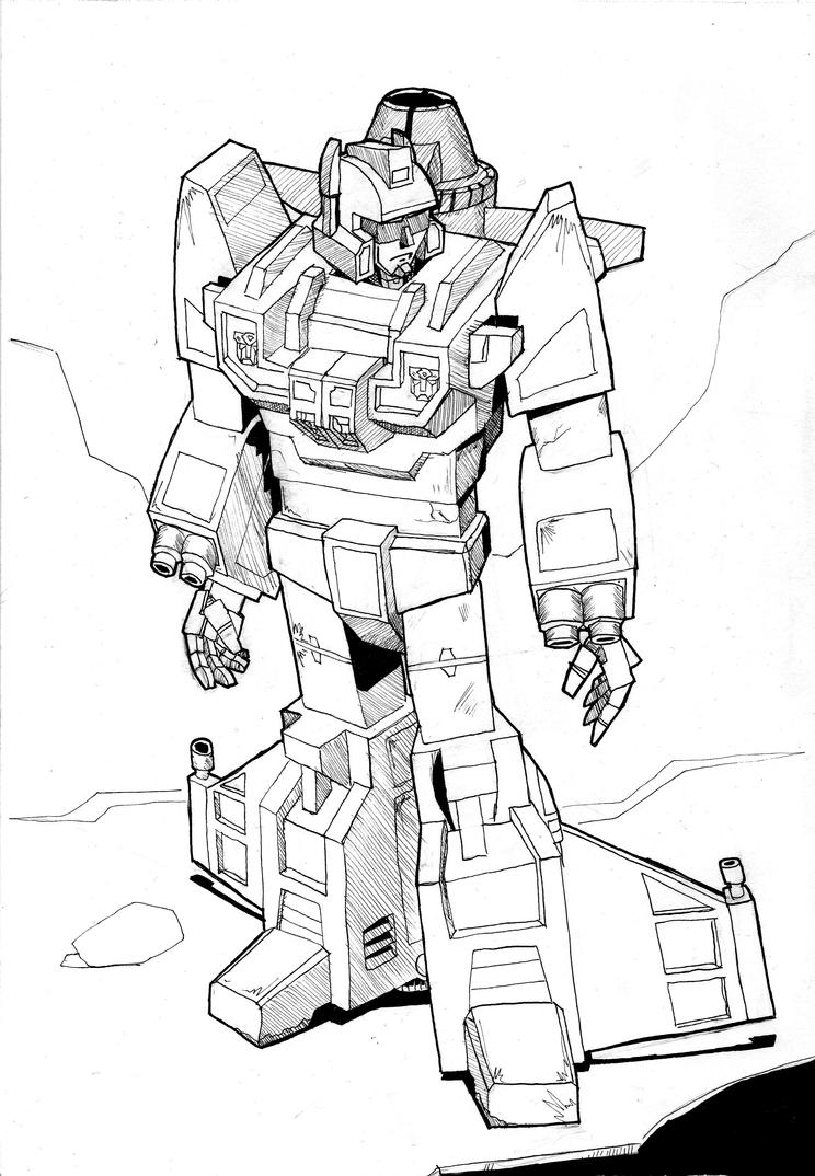 And, my god, did I ever get Rung wrong... In my defence this was done just after AA, so all the ref I had was his tiny cameo in the Maccaddams brawl. 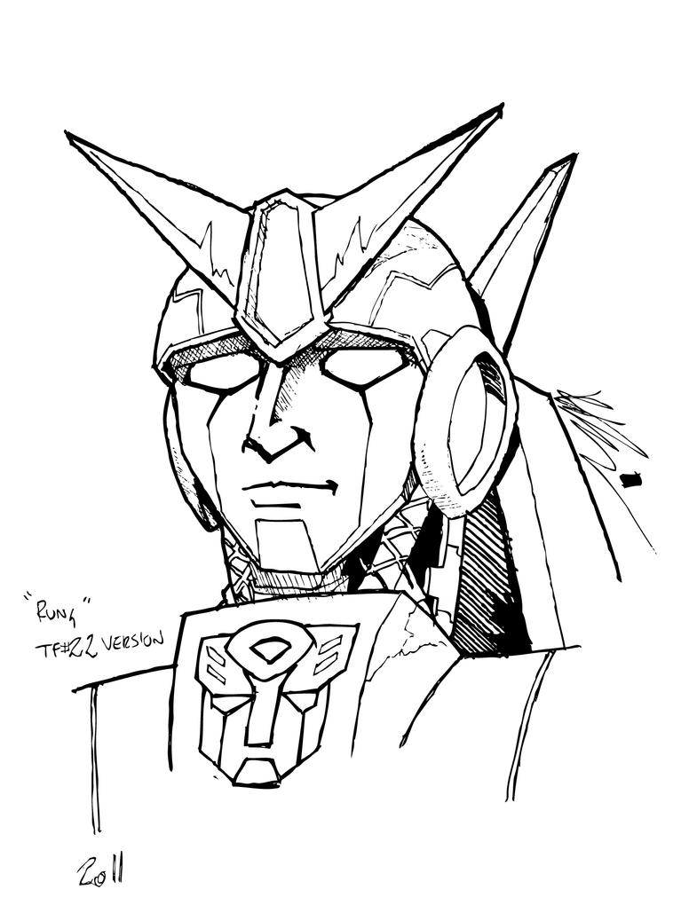 |
|
|
|
Post by legios on Jan 17, 2012 21:08:59 GMT
Been a while, so... Nothing new for those of you who watch my dA pages, but... The rest of you deserve pain also! That IDW-Ratchet doesn't bring me any pain. He's quite good, suitably chunky and boxy in the way that he should be. Call it Alternate Rungs...... As an extrapolation from what little you had to go on I don't think it is bad going. Karl |
|
|
|
Post by blueshift on Jan 17, 2012 21:40:16 GMT
Been a while, so... Nothing new for those of you who watch my dA pages, but... The rest of you deserve pain also! I think these are rather good, don't put yourself down! If I have some comments, I'd say the biggest issue is to mind the proportions - Bumblebee's head/hands come to mind there, they look a bit off. There's also a noticable wobble in some of the lines (though I don't like mechanical lines myself so not sure what to suggest). I like the Ratchet/Bumblebee picture the best, mostly becuase it's more dynamic. To me personally, a piece of art is always nicer when it is telling a story or showing us something. That is why I tend to dislike most of the Dreamwave pinups - sure they look nice but at the end of the day they're just a character crouching, repeat a hundred times. With Scattershot for example - why are you drawing him? What's going on in the picture besides a picture of Scattershot? It looks like you were going for something by making him look at something off-page, but what? I can't find his website at the moment, but I love Jackpot's art: www.tfw2005.com/transformers-images/fan-art/tags/JackpotHe's got a really good grasp of dynamic art - even if there's just one character in a piece, there's still a lot going on over and above that character just posing and I do think it's definately something you could do! Of course the above opinions are from someone who can't draw to save his life! Overall I'm impressed, don't be too hard on yourself! |
|
|
|
Post by Benn on Jan 18, 2012 9:17:35 GMT
Well, the Scattershot one is easy to explain, at least.
Recently, the porprtions in my art have been getting abit skewiff. Gorilla style arms and whatnot, so I wanted to try doing something that was just to get the scale issues sorted. The forced perspective is an easy cheat on that, as the arms are supposed to be longer that way... heh, me am sneaky.
I guess I just got a little carried away in adding a background... there really wasn't any intention to put that there when I started.
I see what you mean about there not being too much going on with him. He is very static. I guess thats the next stage of my development, then... Every image tells a story! It seems appropriate, as I was kinda harping on about that earlier in the week, trying to explain that a good comic shouldn't really need words to express what is going on generally.
I am still kinda chuffed with that Ratchet/BB peice. Not often I draw two people together who look like they're supposed to be part of the same image. For some reason, Ratchet's shoulders bother me, though.
And as for Rung, maybe thats what he looked like before he got his face mushed in that brawl?
Also, Alex Milne was not amused when I described his Rung's face as 'scary'...
Thanks for the feedback, guys!
|
|
|
|
Post by Benn on Mar 9, 2012 8:51:07 GMT
Double posting! ;D But I guess it's okay... Right. 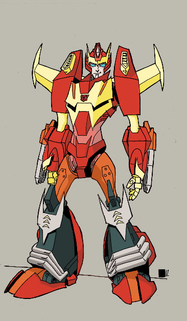 Affectionately known in my head as "Kingdom Hearts Hot Rod". |
|
|
|
Post by Toph on Mar 9, 2012 21:27:12 GMT
Oooh! I love your art! You have a very Nick Roche flavor! I'll definately have to watch you on DA if I can ever get back there.
Don't feel bad, everything I've heard about him, is that Milne is a major douche.
(Although my interactions with him through DA have always been pleasent)
|
|
|
|
Post by legios on Mar 9, 2012 22:32:06 GMT
Interesting look to that - very sharp and angular seeming. Quite like that.
Karl
|
|
|
|
Post by Andy Turnbull on Mar 10, 2012 0:44:10 GMT
Nice work Ben.
Andy
|
|
|
|
Post by Andy Turnbull on Mar 11, 2012 21:09:24 GMT
PS - please check your PM's.
Andy
|
|
|
|
Post by Benn on Mar 24, 2012 10:34:29 GMT
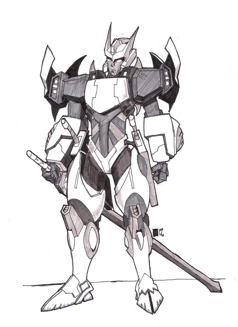 Drift. Really not a fan of Alex's design on this guy, but there was thought he may turn up in a future project so, I had a go at making it acceptable to me. Didn't quite work. That head jut looks wrong on that body, I feel, and it doesn't help I've put it a bit too far back. But why the bubble thighs? WHY? And just what the hell is he supposed to transform into? And given that they're trying to find the denizens of Crystal City, why hasn't he gone back to that body (which was a perfectly good Cybertronian form, given that we've seen Crystal City 'bots on Cybertron already) instead of this stupid thing? <deep breath> |
|
|
|
Post by Andy Turnbull on Mar 26, 2012 22:04:32 GMT
A fine attempt.
I agree it's not a great design and the thighs do look a bit daft.
Andy
|
|
|
|
Post by Benn on Jul 23, 2012 10:56:18 GMT
PRE-AUTO ASSEMBLY ART SPAM! Figured I'd rectify my early attempt at Rung, and get it right this time! Not happy with his eyes, but what can you do? 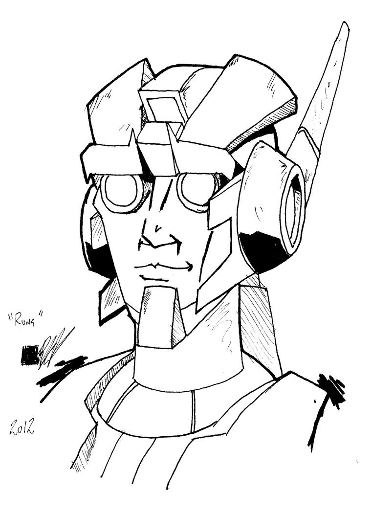 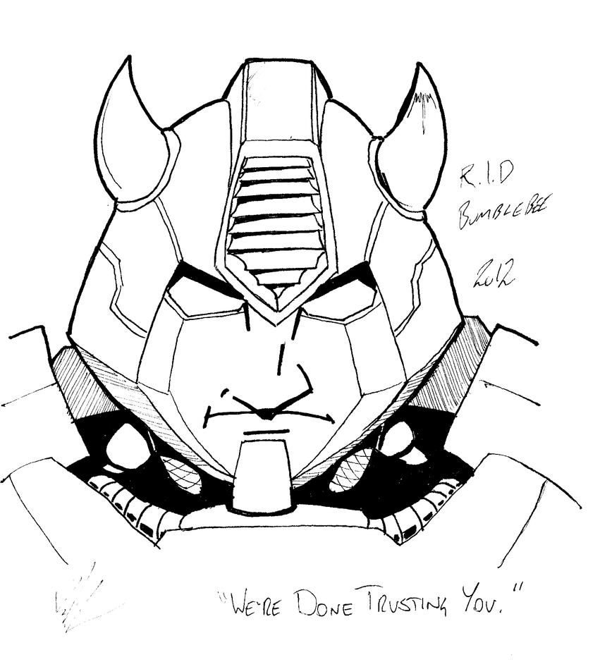 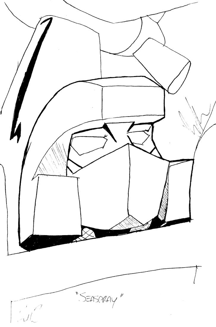 Waoh, these are bigger on here than I thought. Anyway, I'm least happy overall with the Thunderwing one, because it looks too much like I just copied a Geoff Senior panel. At least the rest are beginning to carry a stamp that looks like, for want of a better phrase, "my style", distinct from most others. And that's pretty good, I feel. 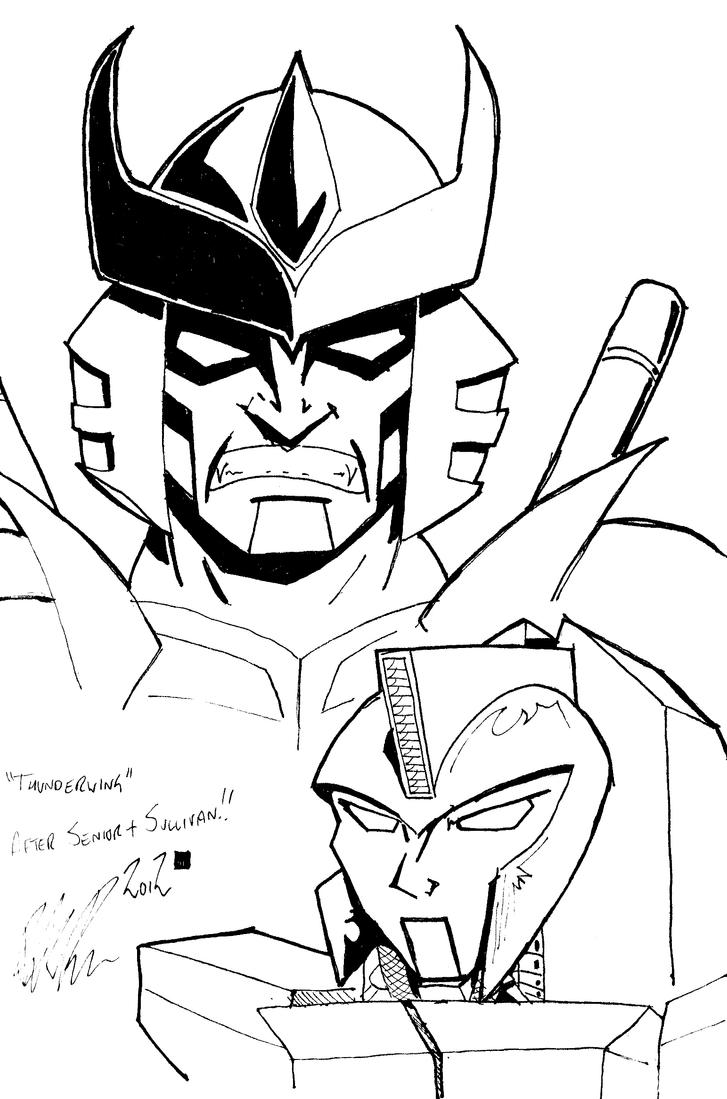 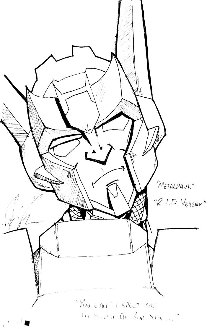 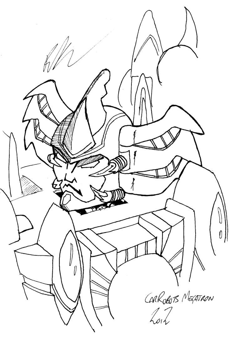 |
|
chrisl
Empty
  I still think its the 1990s - when I joined TMUK
Posts: 1,097
|
Post by chrisl on Jul 23, 2012 14:09:21 GMT
awesome stuff  |
|
|
|
Post by Andy Turnbull on Jul 23, 2012 15:40:16 GMT
Bumblebee is looking fantastic.
Andy
|
|
|
|
Post by legios on Jul 23, 2012 19:32:26 GMT
T'is a cracking Bumblebee. I am quite liking the Metalhawk - it has that slightly skeptical/quizzical quality that I think goes a long way to expressing his character nicely.
Karl
|
|
|
|
Post by Benn on Aug 13, 2012 14:55:48 GMT
|
|
|
|
Post by legios on Aug 13, 2012 19:16:19 GMT
Fantastic stuff there. I do like the Prime Wheeljack - you've managed to give him that "grim set to his jaw" look, not bad on a 'bot who doesn't actually have a jaw.... The Thunderclash is absolutely cracking as well.
They are all good, but those two really stand out for me.
Karl
|
|
|
|
Post by Benn on Jan 28, 2013 20:54:45 GMT
Wow, this page has been going for nearly two years... I need to get a bit more prolific.
|
|
|
|
Post by Bogatan on Jan 28, 2013 21:32:51 GMT
Really good stuff,I hadn't seen the pre and post AA dumps. Metal Hawk and Rodimus look really good.
And I do like your Senior Thunderwing. The world needs more Senior Transformers, even if it's not him drawing them.
|
|
|
|
Post by Andy Turnbull on Jan 28, 2013 23:27:56 GMT
Indeed!
Andy
|
|
|
|
Post by Benn on Jan 30, 2013 14:52:13 GMT
Brief access to a scanner allows me to present: 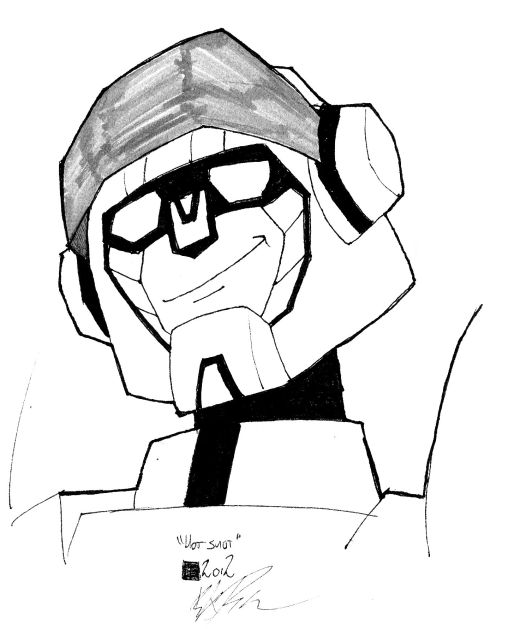 Animated Hot Shot (I believe Andy can take some of the blame for making me want to draw more of this guy) ![]() 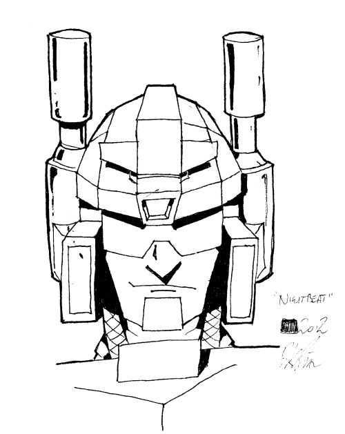 Nightbeat. This guy is just fun to draw... 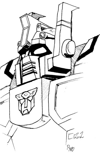 And Pyro. The last of the LSOTW newbies that I hadn't gotten around to. Scoop is the only IDW pseudo-Wrecker still undone on the list. |
|
|
|
Post by Andy Turnbull on Jan 31, 2013 18:30:12 GMT
Whoa, I'm sure I only drew him in a few panels, you should however, be Animated Rodimus drawing like there is no tomorrow!!
All grand, but I really like that Pyro.
Andy
|
|
|
|
Post by Benn on Sept 6, 2013 9:52:17 GMT
There is an Animated Rodimus on the way.... but for now: 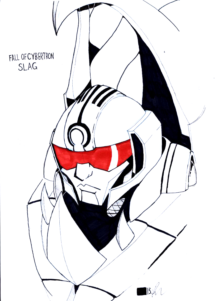 Not-Slug. 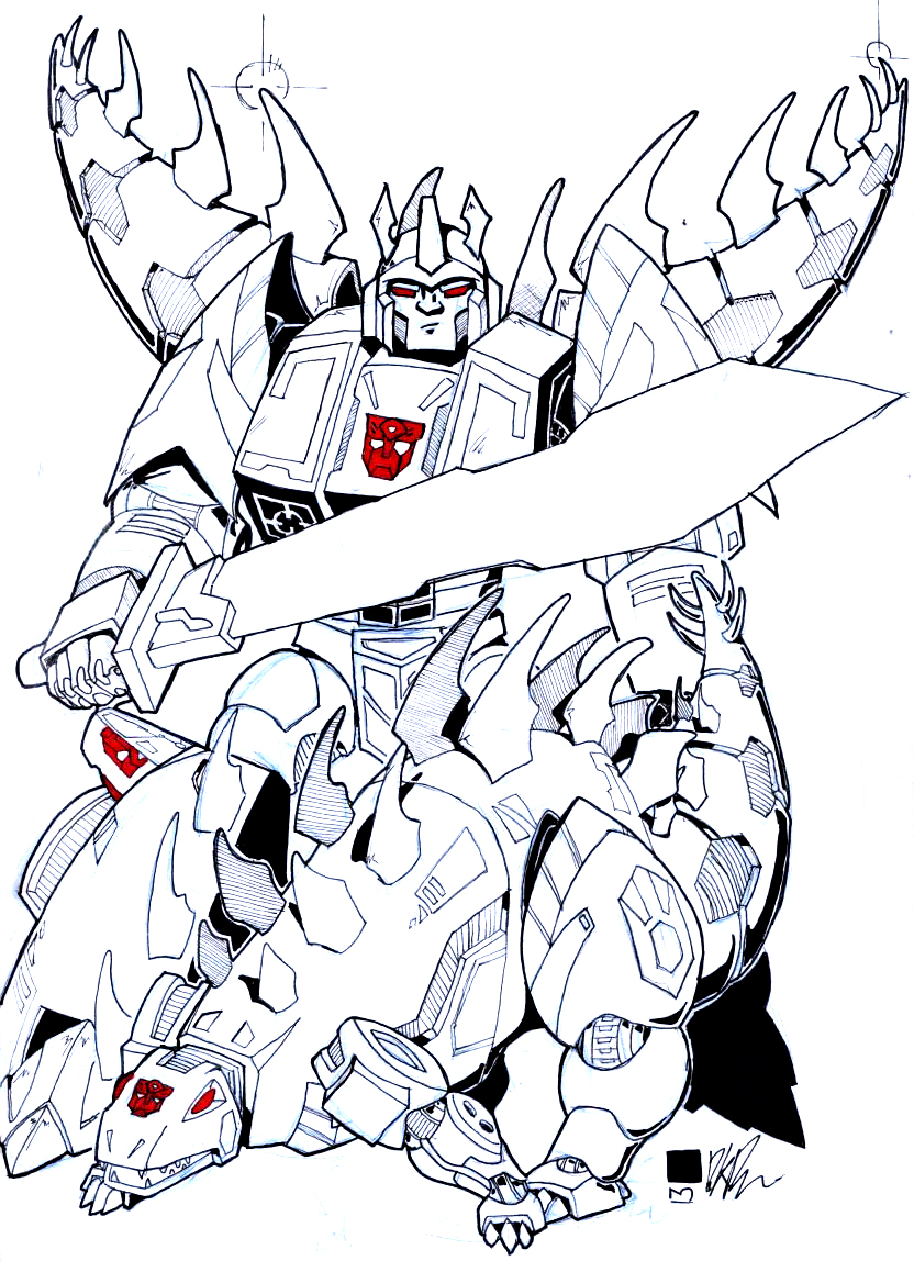 A mixup of my favorite Snarl designs to create... UBER-SNARL. 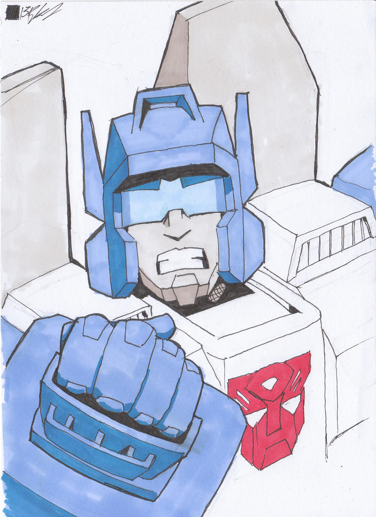 Angry Topspin! 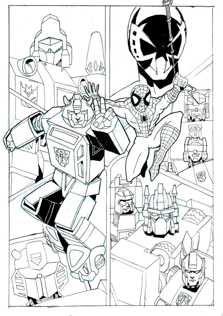 Lines for Dan Gilvezan's AA tribute art thing. I never got it finished this year, though. 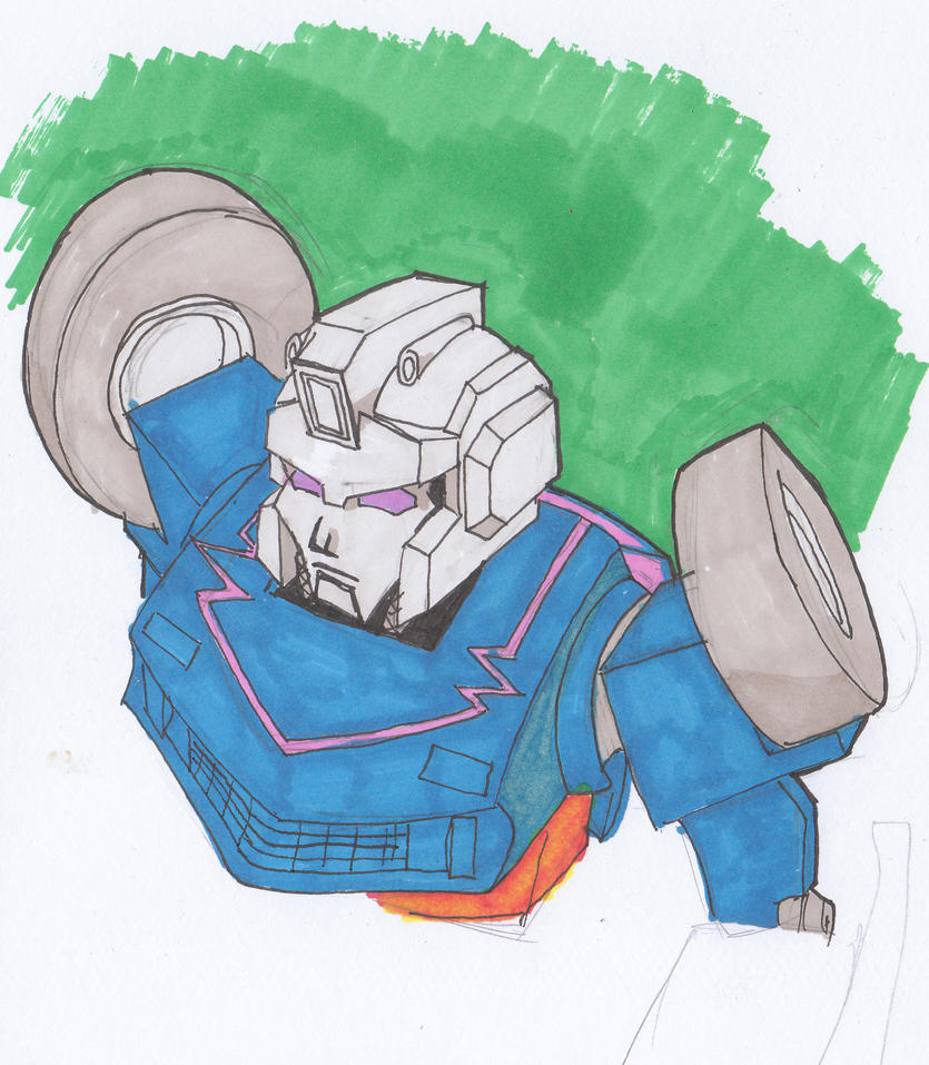 Inspired by picking him up (minus gun, alas!) at AA, 'tis Skram! 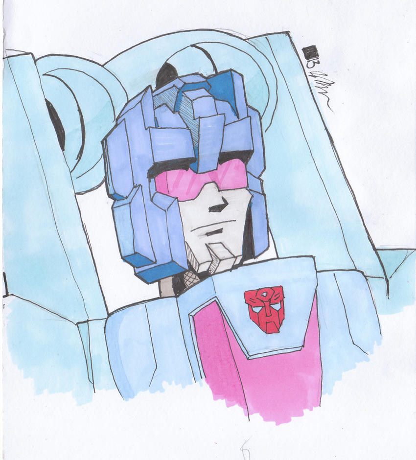 And my 2013 rendition of Rotorstorm. |
|
|
|
Post by Andy Turnbull on Sept 29, 2013 16:37:15 GMT
Very nice, I especially dig Rotorstorm.
Andy
|
|
|
|
Post by legios on Sept 29, 2013 19:54:09 GMT
Great stuff there indeed. The "Ultimate Snarl" is pretty nifty.
Karl
|
|
|
|
Post by Benn on May 3, 2014 17:36:07 GMT
Okay guys, something new that I'm working on. These things are all playing card sized. 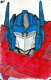 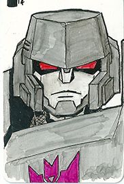 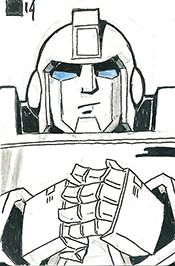 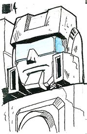 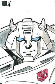 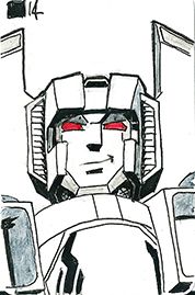 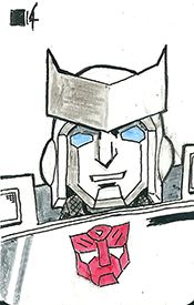 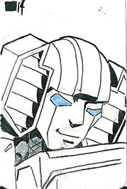 All based on EJ Su's designs around the " -ations" run at the moment. Little scrappy at the moment, as the glossy card is damn hard to remove even soft pencil lines from! Hoping I'l get better at them as I practice... I was thinking of trying to sell them at about a pound a pop, but a trial run on the ebay has yielded little interest, so I was wondering if any of you fellas had any advice? (S UBTLE PLUG)I am hoping to start taking commissions as well these days, so if any of you would like some sort of arty thing done (doesn't have to be small cards or giant robots), hit me up. ( SUBTLE PLUG ENDS) |
|
|
|
Post by blueshift on May 3, 2014 18:22:29 GMT
Oh wow, looking good!
Selling stuff cheap is good for impulse buys, but on ebay where you have postage on top, it's less good (and then ebay fees and paypal fees...). It might be worth making some for Auto Assembly, or maybe taking commissions for them? Perhaps you could concentrate on characters who are represented by voice actors there, so people could get some original art signed?
|
|