Deleted
Deleted Member
Posts: 0
|
Post by Deleted on Jan 31, 2014 20:20:21 GMT
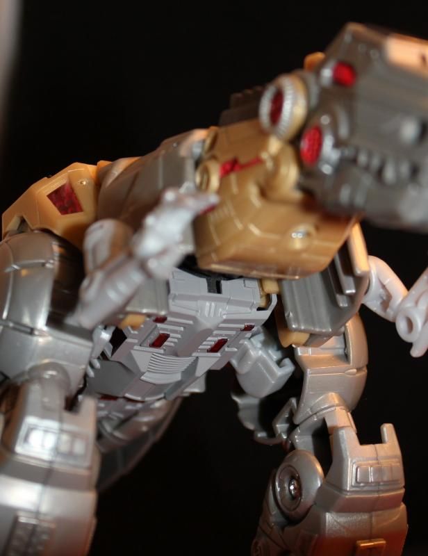
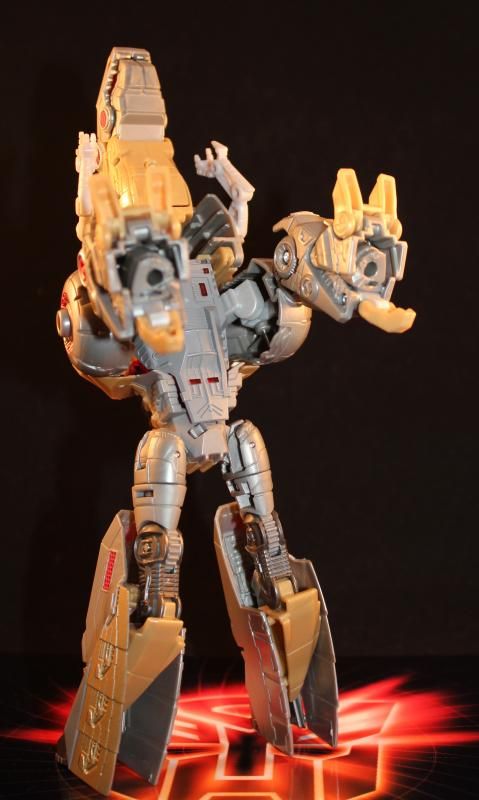
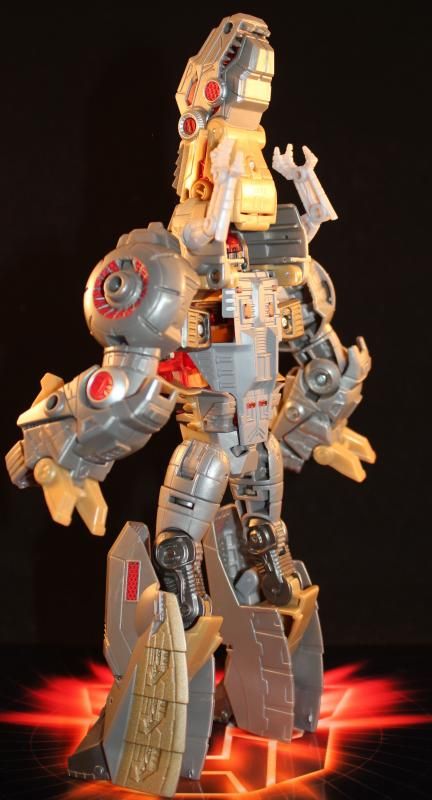
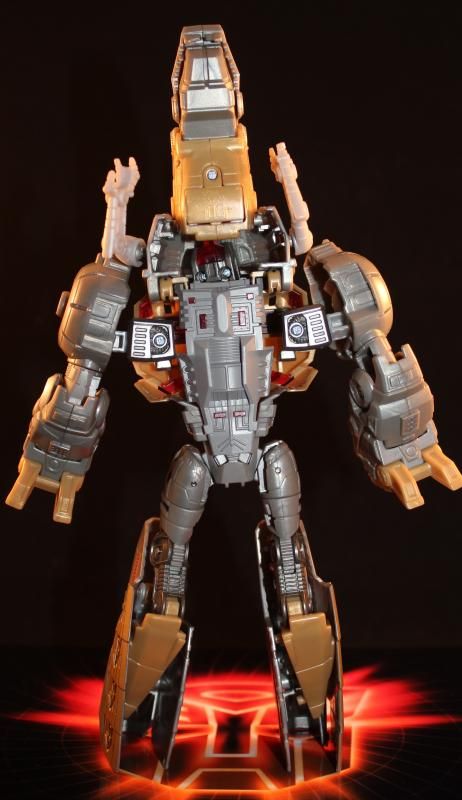
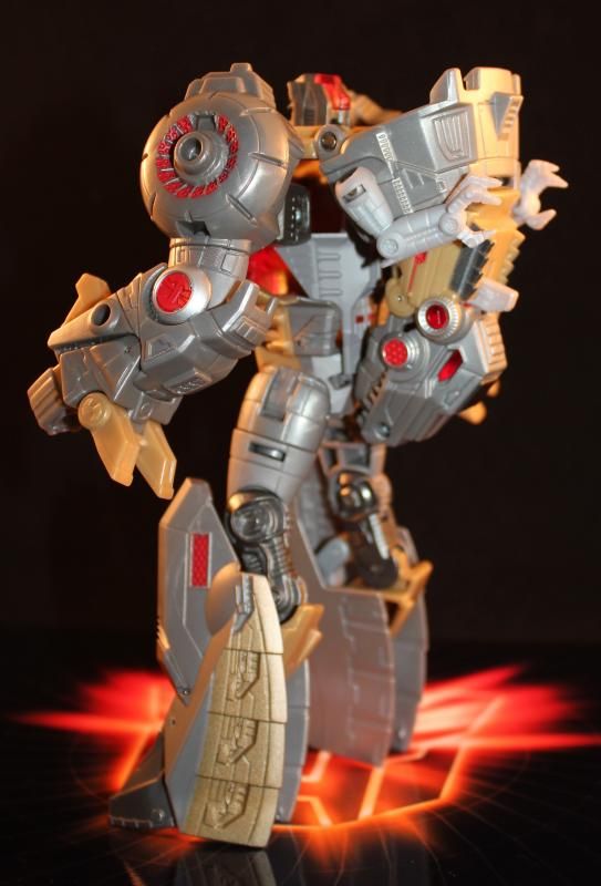
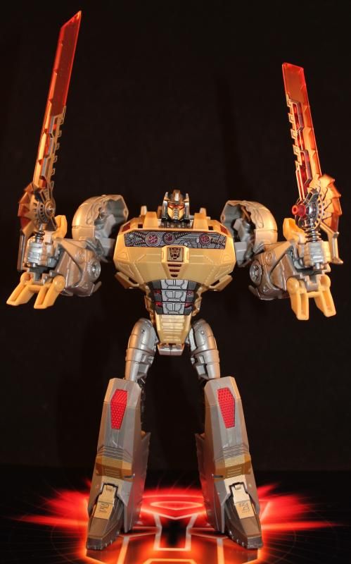
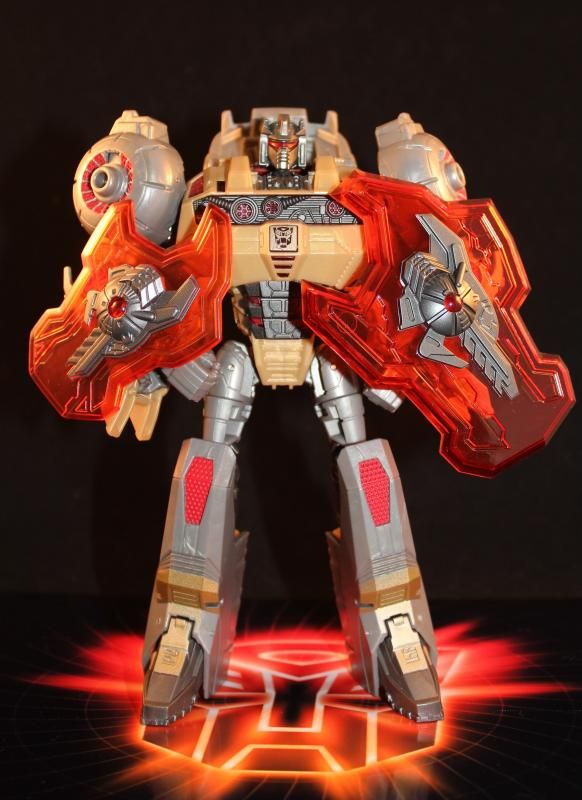
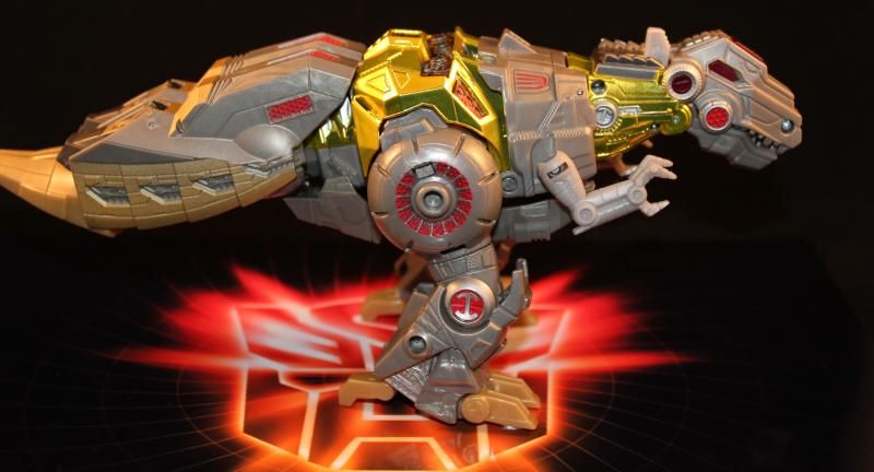
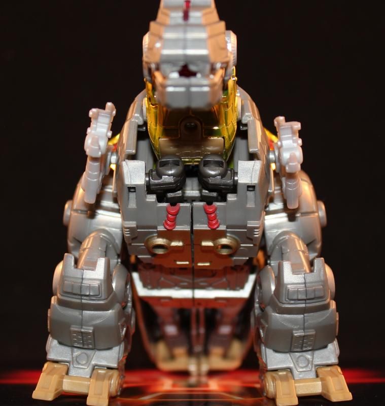
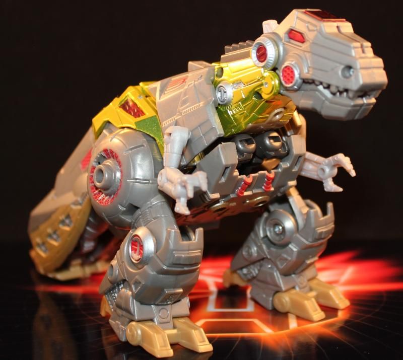
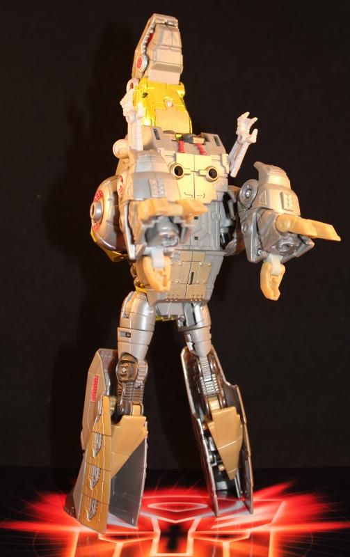
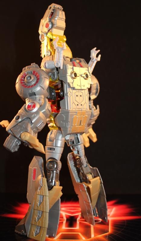
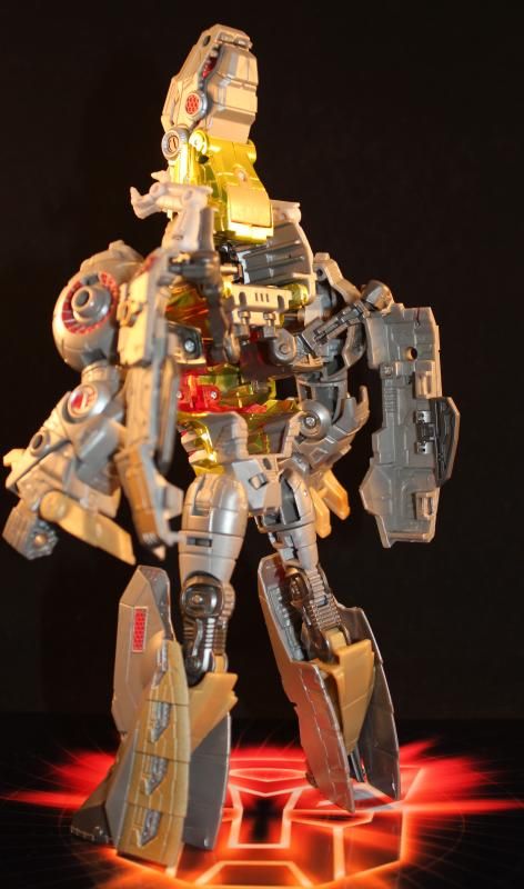
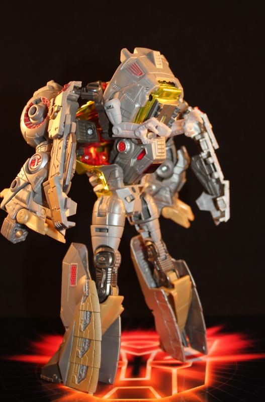
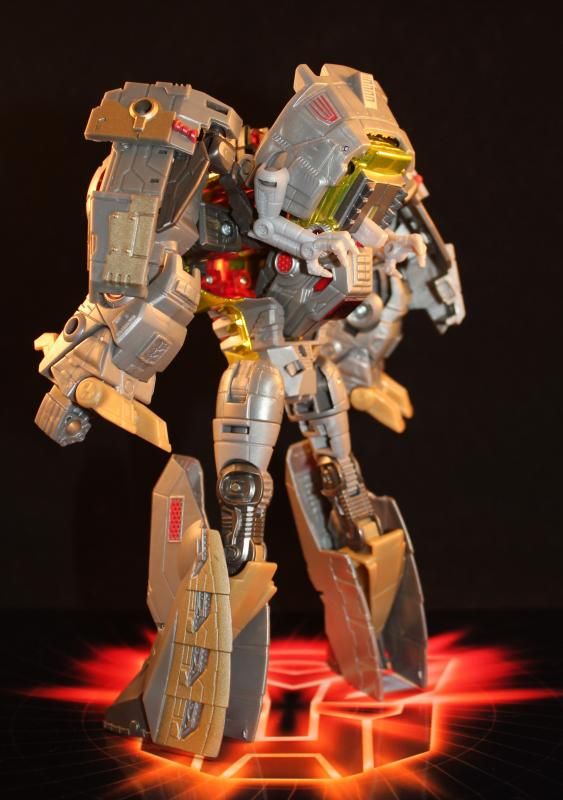
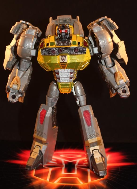
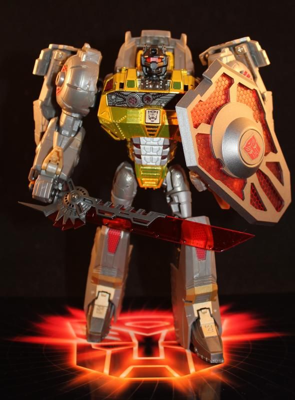
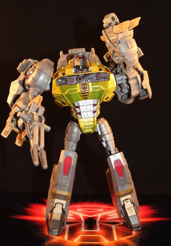
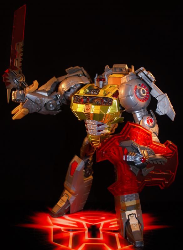
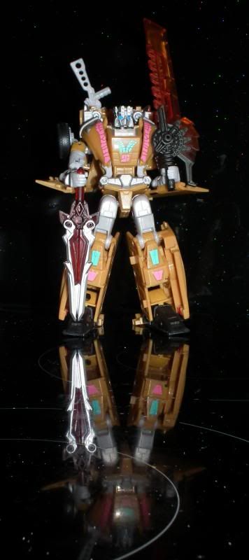
FoC Grimlock was an enjoyable character in the game but the figure had more than a few shortcomings. I've put together a little 'compare and contrast' project to see if there's any third party peripheral that can enhance the figure enough to endear him to Grimmy fans. For this I've used: ZF-001: Cretaceous Advancement By Zenith Forge. The set comprises a belly/back filler, oversized sword and shield (with variable attachment options) and head modeled after the MP version. IF-EX01 Upgrade Kit By Iron Factory. This is a belly filler that splits apart to give more weight to the arms. Also included is G1ish gun that can be split into two smaller blasters and several variable joints that give one or two extra options, including giving you the option to attach his dino arms to the external plates to generate a G1/classic look. AoT - 001 Retro Rex By ArtTek. This is a G1-styled head mod that comes with both red and green lenses. A-02 Cold Weapons for OP - Red Version (LE 400) By SXS. Originally picked up for WfC OP, it became apparent they didn't suit his size. The shield, however, proved to be well proportioned for FoC Grimlock and lends a little more metallic weight to the figure. Here we go... First up is the Cretaceous Advancement belly/back piece:      You can see from the last pic that the head is no longer inserted into the chest cavity and just hangs down.  You can see a good size comparison here with the swords. The Cretaceous Advancement sword is in his right hand. The standard head is used.  Here's a comparison for the shields. I can say the plastic quality is excellent for the red. The belly piece is a bit minimal but serves a purpose. Next up is the Iron Factory offering. It's a promising start for a new 3rd-party manufacturer.          Here's the end result with the Retro Rex head fitted. I'll be honest, I wasn't that impressed but it is noticeably bigger which might encourage you.  This is the SXS Cold weapons shield. I like how it fits in with the 'red laser' theme and has more weight to it.  The terrible G1-ish blaster from the Iron Factory set. The peg was so bad, it can just fall out of his hand if inverted - it definitely feels like an afterthought. Arktek also do a Retro Rex Blaster which by all accounts looks much better. The Cretaceous Advancement MP-styled head is attached.  So in summary, I think Iron Factory have the better belly filler and I like how it beefs up the arms. But the Cretaceous Advancement set comes with a really nice sword, shield and head. The Retro Rex head and Cold Weapons shield are down to personal taste and are over-priced for what you get. I hope that gives people a better idea of what these 3rd parties can do. If you want any more detail then just ask... |
|
|
|
Post by Toph on Jan 31, 2014 22:46:58 GMT
I have the art tek head and gun, and can speak for their quality and sculpt.
Beyond that, its an abomination of a toy that's unsavable. No 3P filler can help it. Worst grimlock ever. Says a lot given how much of an abomination the MP version is.
|
|
Deleted
Deleted Member
Posts: 0
|
Post by Deleted on Feb 1, 2014 18:31:50 GMT
I can't quite grasp the hate it generates to be honest. But I don't have the emotional attachment many long-term fans have with the original. Nor am I especially bothered with anatomically correct robots based on creatures that existed millennia before we did. Moreover, I like that the tail-dragging MP harks back to a time when we still understood the creatures to walk like that.
I do however like the character from the game and these kits have allowed me to recreate that feel quite nicely. I look at the toy and he looks pretty cool, poses quite well and stands well amongst other characters in the line. I mean, look at that last picture... He looks bad-ass!
|
|
|
|
Post by Pinwig on Feb 1, 2014 19:42:37 GMT
Excellent pictorial review of the various extensions, it's really great to see the options that figure has in detail. I like the Iron Factory one because of the weight that adds to the shoulders in robot mode. I can see why this figure is disliked by most people, but I rather like it too. From the right angles. I think it deserves a little more love than it gets. This afternoon I unpacked my new mini studio and had a good play with it. Not started proper photos yet but I had a lot of things to experiment with, like ambient light changes, positioning the two lights, different coloured backdrops, persuading my camera to focus on the right bit, distance/zoom, I've learned a lot through experimentation. No photos I'm really proud of yet, but I was using my Grimlock to compare to the pictures you have here in trying to achieve the same results. Below is about the best so far.  |
|
Deleted
Deleted Member
Posts: 0
|
Post by Deleted on Feb 1, 2014 20:12:41 GMT
That's a great effort! It shows me what I'm missing by having a floor plate. I like it because it represents a 'stage' of sorts (and makes my photos more identifiable if they start turning up elsewhere) but I like how your shot removes any depth of background, leaving the figure front and centre. a question: are you using any program for post-production? The chief difference between your shots and mine is that you seem to have more light across the board, to the point where the glare bullies his chest motif out. I've had similar issues but being able to reduce the brightness post-production has usually rectified them.
But I am really impressed with the overall focus in the picture. If i may ask, what camera are you using and which settings worked well to produce this kind of all-over coverage. I'm looking at my photos and seeing a lack of depth. I quite liked that to start with but seeing your photo makes me think i should start experimenting with deeper focus distances in preparation for more action-orientated shots.
Meanwhile, back on topic...
With you on the Iron Factory piece. I figure his skinny legs made him look a little top-heavy. If you're going to go for that look, then you might as go the whole hog and support it...
|
|
|
|
Post by Bogatan on Feb 1, 2014 20:43:35 GMT
Great pics, I had been tempted by some of the 3p sets, but in the end they were all fixing a problems I wasn't having. I think the robot mode is a brilliant update of the original design, so no real need for modification. At a push I'd prefer a more G1 like head, but I don't have a problem with the one it has.
But dino mode isn't so good, just not worth the hassle, it's not even the gaping whole in the chest which in fairness wouldn't be visible if people (including myself ) weren't trying to pose it like a G1 Grimlock. If I was being given one I'd get the Iron Factory chest filler, but I'd still not like the Dino mode so really there's no point.
Nor have a I played the game so dont have a reference point that makes me think the sword or shield are too small. Having said all that I am much more into 3p add ons like these than whole brand new 3p toys. Those headds for Classics Kup are brilliant.
|
|
Deleted
Deleted Member
Posts: 0
|
Post by Deleted on Feb 1, 2014 21:05:27 GMT
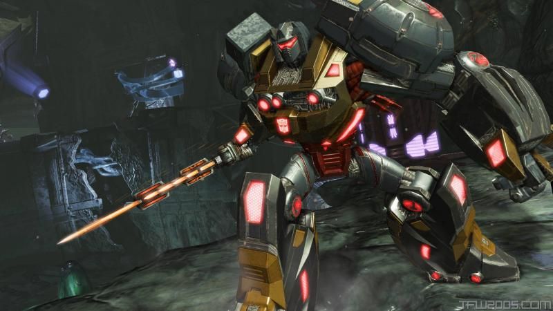
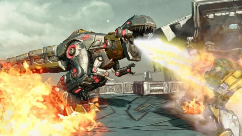
It's not so much that the gear is too small. More that it's too light. If you look at the below screen shots you can see that the concept was to make him heavy and bulky. These 3rd party pieces help give him a little more weight. Also, for the record, you can see Highmoon made a pretty good robotic T-Rex model that sadly wasn't followed through by Hasbro.   |
|
|
|
Post by Bogatan on Feb 1, 2014 22:04:24 GMT
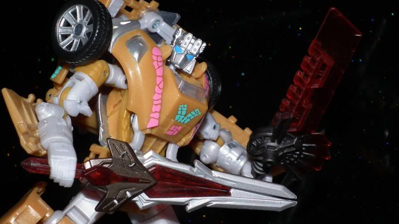
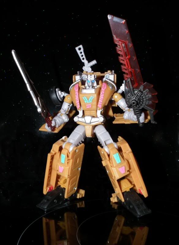
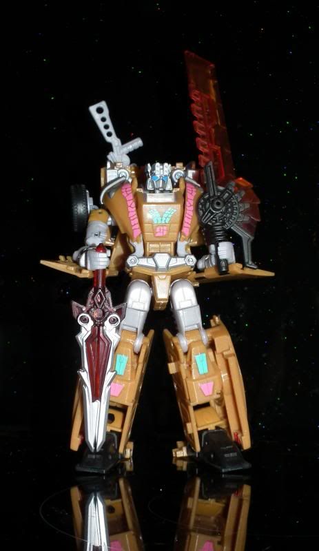
Yeah that looks better in dino mode, but I still don't overly like the design that much I guess. And just to invert the thread a little. When I got Grimlock at Botcon last year he became a parts donor to a Botcon toy that was sadly lacking.  Electro also got FOC Airraids weapon too and wont give them up. On the topic of photos I've meant to try this back drop for pictures for a while and this gave me an excuse. I'm really glad I gave it a shot. Its the hob and splash back in the kitchen. I had to photoshop the odd strong reflection from the flash and the gap between the hob and the wall (and also some grease mark that tell me I need to clean it better:) )   The full length reflection is great.  |
|
|
|
Post by Pinwig on Feb 2, 2014 11:04:33 GMT
That's a great effort! It shows me what I'm missing by having a floor plate. I like it because it represents a 'stage' of sorts (and makes my photos more identifiable if they start turning up elsewhere) but I like how your shot removes any depth of background, leaving the figure front and centre. a question: are you using any program for post-production? The chief difference between your shots and mine is that you seem to have more light across the board, to the point where the glare bullies his chest motif out. I've had similar issues but being able to reduce the brightness post-production has usually rectified them. I'm fortunate enough to have Photoshop still in my possession from a previous life in design. I've used it a lot for graphics but not really for serious work on photographs, I'm a novice in that field. So that Grimlock picture had some work done on the contrast which might have cause the flare on his chest to worsen. From what I learnt yesterday I think I'd solve that problem more by pulling the light back than trying to tone it down in post production because darkening it would begin to lose some of him into the background. I started out yesterday using the white backdrop because I'm effectively doing this for my own catalogue I wanted a more clinical, bright background, but I found very quickly that the figures look a lot worse on white. I have yet to work out why that is, but when I took photos on white and then immediately on black the difference was incredible. Maybe it's white balance because I was using automatic settings, maybe it's something to do with the way the light reflects off light and dark surfaces. I need to find something to read about it. I did a lot of fiddling, I need to write it all down. Buying a new camera has been on my to do list for several years, mine is pretty old now. I have an ancient Fuji Finepix 6900z (circa 2000) that I still use because it takes great photos in bright light, but yesterday I was using my other one, a Konica Minolta Dimage A200 shooting in RAW mode (no compression) and without the flash. The flash was bouncing too much light off the front of the figures. I know from experience that to flatten out images you need to move the camera back and use the zoom a bit, but getting the balance between that and clarity in the image I'm still working on. I think yesterday I ended up taking photos between 50cm and 1m from the figure. As for the camera settings, they were taken on the auto setting, so I don't really know what precisely that would be. I found the camera has an exposure offset function which can adjust the auto to let in more or less light, and I found that letting in slightly less light gave a better picture - but then photoshop would also compensate for that. Hmm, all this should really be in the cheap tricks thread. Moderators! take action if you deem it necessary. |
|
|
|
Post by Pinwig on Feb 2, 2014 11:07:31 GMT
On the topic of photos I've meant to try this back drop for pictures for a while and this gave me an excuse. I'm really glad I gave it a shot. Its the hob and splash back in the kitchen. I had to photoshop the odd strong reflection from the flash and the gap between the hob and the wall (and also some grease mark that tell me I need to clean it better:) Those are excellent. I love the idea for the backdrop. I was thinking yesterday that a real reflection rather than a faked one (because the angles would be wrong) might add something to the photo. The stars there are brilliant. |
|
|
|
Post by Bogatan on Feb 2, 2014 13:29:48 GMT
Thanks.
The stars were a happy accident as I'd assumed the glitter wouldn't show up because of the flash and the gloss surface of the splash back.
|
|
|
|
Post by legios on Feb 2, 2014 20:26:28 GMT
Sifu, Bogatan, you have both taken some fantastic pictures there. Mightily impressed with the photography. The various unlicensed addition kits for FoC Grimlock look interesting, and certainly do a lot to improve the aesthetics of the toy in my view. Can't say their existence makes me any more interested in owning it, but then the things that made it fail to apoeal to me weren't really any design aspects of the toy, more spillover from not really enjoying those levels of the game I think.
Karl.
|
|
|
|
Post by Philip Ayres on Feb 6, 2014 17:48:02 GMT
I have the art tek head and gun, and can speak for their quality and sculpt. Beyond that, its an abomination of a toy that's unsavable. No 3P filler can help it. Worst grimlock ever. Says a lot given how much of an abomination the MP version is. Why don't you like the MP version? Fix the shoulders/hips and give it a decent gun and it'd be ok I think |
|
|
|
Post by Philip Ayres on Feb 6, 2014 17:56:23 GMT
I'm tempted by the blaster and it's clear blue and orange chums. |
|
|
|
Post by Toph on Feb 6, 2014 22:17:14 GMT
I have the art tek head and gun, and can speak for their quality and sculpt. Beyond that, its an abomination of a toy that's unsavable. No 3P filler can help it. Worst grimlock ever. Says a lot given how much of an abomination the MP version is. Why don't you like the MP version? Fix the shoulders/hips and give it a decent gun and it'd be ok I think As I say constantly, completely rubbish and worthless Dinosaur mode. The only one with a worse dinosaur mode is the FoC. Because while one could argue MP should look like he steps out of the fifties (you will never convince me of it, but at least I'll accept it as a valid argument), no dino tf designed post 2000 has any business looking like it did. But yeah. Masterpiece Grimlock is no masterpiece until he gets a proper alt mode. |
|
|
|
Post by Pinwig on Jul 19, 2014 22:19:58 GMT
Sifu, with your ability to sniff out the stuff you need on the internet for your customs, do you know of anywhere that still has the Zenith Forge set in stock? I'm loving what the Iron Factory set does for his arms, but I'd like to try the MP style head too. The Retro Rex one doesn't look right to me. No where I've seen has it, including ebay it seems.
Dunno why I love this figure so much, but I keep coming back to it and the Iron Factory upgrade is awesome. First time I've been excited about adding kibble to a figure.
|
|
Deleted
Deleted Member
Posts: 0
|
Post by Deleted on Jul 19, 2014 23:34:14 GMT
I got mine from Robot Kingdom but I'm sure you've already seen they've sold out. However... I sold one of my FoC Grimlocks on eBay and it was only when I went to pack him up did I realise he'd got the Zenith Forge back plate in (I use the Iron Factory piece on my keeper). I was annoyed that I hadn't included it in the listing so I took it off before I sent Grimmy... It's yours. I'm still using the sword and shield but I've even got a different head on there now (the King KickButt head) so you can have that bit too? Let me know if you want them and I'll dig them out when I can. I'll keep an eye out for the complete set though in the interim. |
|
|
|
Post by Pinwig on Jul 20, 2014 9:40:44 GMT
Message sent!
So there's another 3P head too? I'd not heard of the King KickButt one, but I'm not sure about the teeth. Are there any other 3P kits for this figure not mentioned here? it's had loads of attention. I'm thinking I might give the reprolabels set a go too, although it does look like all that does is go over all the existing red paint apps to give them more definition.
|
|
Deleted
Deleted Member
Posts: 0
|
Post by Deleted on Jul 20, 2014 18:35:13 GMT
The KickButt head is a good compromise between the more angular standard and MP-styled heads and the chunkier Retro Rex head. the teeth are barely visible but the overall shape is quite nice.
I haven't seen any more add-ons other than the ones here (I think!). I saw a custom job on eBay that used a head swap from another Generations figure (a car Autobot but I forget which one). Personally, I'm now looking at all the new Dinobot figures coming out to see if there's some legs I can pinch that might be a bit shorter and wider. Obviously, it'll mean no alt mode but on display he might look more game-accurate.
|
|
|
|
Post by Pinwig on Aug 30, 2014 12:14:14 GMT
I'm celebrating my first anniversary of registering on this forum today (I signed up in my excitement about wanting to point out MP Soundwave had appeared at UK TRU's, having lurked for a bit), so here's my version. This was supposed to be a quick phone photo so I didn't get the tent out. I know this toy has a lot of hate, but it's been one of my favourites of the Generations era, particularly the robot mode. I have looked at and experimented with loads of the upgrades for it, and have settled on this as being my ultimate. Big thanks to Sifu for providing the head because I'd not have found it otherwise. Bigger version hereOf those sets: Iron Factory ArmourAlso comes with a twin barrel gun which splits apart and attaches to his shoulders, but it's cheap and nasty and the grey colour is wrong. The peg is also too thin so it flops about. You can also configure the armour plates to look more G1 by attaching the dinosaur arms to it and fixing them closer to the body, but doing that makes an almost permanent change to the figure which is hard to undo and puts his dinoarms in the wrong place in dino mode. I just wanted heft on the shoulders, which this does. Zenith Forge SetI only wanted this for the head. It comes with bigger versions of the sword and shield, but I think those swamp the figure - and G1 Grimlock didn't have a shield anyway. I also think the reprolabel on the proper sword really adds to it. ArtTek BlasterGrimlock needs his big gun, and this one is nice and chunky and G1 styled. This is the matt black version, there's a shiny black one too for the Takara version, as well as clear colour ones. ReproLabelsAs I found out from the BH Prowl set, sometimes reprolabels go too far - but this set is nicely understated. All it does is replace all the red pain apps on the figure, most of which are in recesses, which always seems to work better for stickers. I like this as they give more definition and a bit of shine. It also has a proper G1 autobot logo to replace the one on his chest. |
|
|
|
Post by Philip Ayres on Aug 30, 2014 13:13:07 GMT
I'm celebrating my first anniversary of registering on this forum today (I signed up in my excitement about wanting to point out MP Soundwave had appeared at UK TRU's, having lurked for a bit) Happy Anniversary! |
|
Deleted
Deleted Member
Posts: 0
|
Post by Deleted on Aug 31, 2014 22:41:44 GMT
Happy Anniversary buddy. I genuinely thought you'd been here forever!
Grimmy looks great. Annoyingly, I've just opened a can of worms by buying the Silver Knight OP and Grimlock set. It's the same mould again but shock-horror, it's very G1 themed (he's even got the multicoloured squares on his shins). It's making me want to buy the Retro head and gun (and use that spare back piece too). Oh... and the Prime's bad either. ????
|
|
|
|
Post by Pinwig on Sept 1, 2014 0:38:33 GMT
I've no doubt I'll get one of those if I see one. Did you get it here? How much was it? I don't think the green shins add much but I don't have the platinum version so I'd like one with a shiny chest. And also to have one unaltered to put with my upgraded one.
|
|
Deleted
Deleted Member
Posts: 0
|
Post by Deleted on Sept 9, 2014 10:53:40 GMT
Sorry for the late reply. Yes, I got it here. In the same Tescos that's always packing loads of Predacons Rising stuff.
|
|
