|
|
Post by Andy Turnbull on Sept 10, 2010 12:06:17 GMT
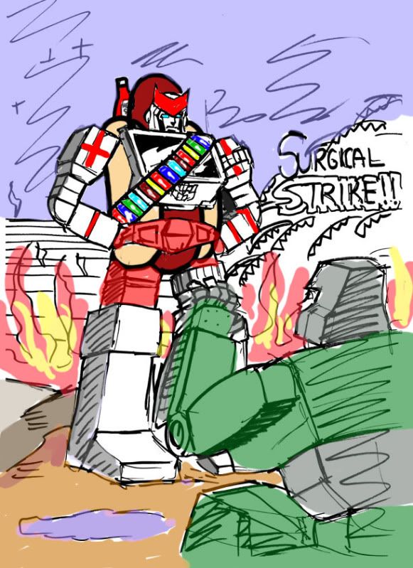
Based on the discussions in the 84 Autobot Leadership thread I was inspired to do a cover image and seeing as how it arose out of hub banter I thought I'd throw it open to the masses. I will do both eventually but one of them quite handily can be used for an upcoming Turn and Burn project so will be an actual fanzine cover. I leave the decision in your capable hands! COVER A  COVER B  I also apologise for the lack of sausage options in this poll. Andy |
|
|
|
Post by Bogatan on Sept 10, 2010 12:10:50 GMT
Me no see anything.
|
|
|
|
Post by Andy Turnbull on Sept 10, 2010 12:11:54 GMT
Mistyped the link, fixed now!
Andy
|
|
|
|
Post by The Doctor on Sept 10, 2010 13:43:20 GMT
I refuse to vote due to the lack of a sausage option.
-Ralph
|
|
|
|
Post by Andy Turnbull on Sept 10, 2010 13:51:51 GMT
Damn you sir!!
Andy
|
|
|
|
Post by The Doctor on Sept 10, 2010 13:57:20 GMT
I'm making a stand!
-Ralph
|
|
|
|
Post by Bogatan on Sept 10, 2010 14:47:30 GMT
Sorry. My wacoms working and I can't help myself.  |
|
|
|
Post by Andy Turnbull on Sept 10, 2010 14:48:24 GMT
Hah!
Andy
|
|
Gav
Drone
  John Travoltage!
Posts: 2,047
|
Post by Gav on Sept 10, 2010 14:49:38 GMT
Cover A, definitely. Coloured by Bogatan of course.  |
|
|
|
Post by charlesrocketboy on Sept 10, 2010 15:21:06 GMT
Cover A - much more dynamic.
|
|
|
|
Post by Grand Moff Muffin on Sept 10, 2010 18:34:53 GMT
Great stuff! I went with B because Ratchet is too powerfully built and bow-legged in cover A (though that could be fixed, and anyway it's G2 so I'm not supposed to like the artwork style, am I?). But the most important thing is that unlike Bogatan you must colour Ratchet's head the comic way.  Martin |
|
|
|
Post by Bogatan on Sept 10, 2010 19:03:13 GMT
fixed.  |
|
|
|
Post by Grand Moff Muffin on Sept 10, 2010 19:19:17 GMT
fixed.  Wahey! Exalted for that. Martin |
|
|
|
Post by blueshift on Sept 10, 2010 19:29:31 GMT
I disagree with Martin, the head should be the toy way. IE not on his shoulders  |
|
|
|
Post by legios on Sept 10, 2010 19:39:33 GMT
I have to say that for me it is cover A that wins it. It just says G2 to me more than the other.
Karl
|
|
|
|
Post by Bogatan on Sept 10, 2010 19:49:40 GMT
I voted A also. Much more G2 and generally a more interesting composition.
Plus Megs on the verge of killing Prime but looking terrified at Ratchets sudden appearance for the win. As those young internet types say.
Andy
|
|
|
|
Post by Andy Turnbull on Sept 11, 2010 10:09:06 GMT
I shall leave the voting open until next Friday.
Both images will get done, but the winner will be the priority and also be used for NOT SO SECRET PROJECT X.
Andy
|
|
|
|
Post by jameso on Sept 11, 2010 12:56:52 GMT
Definitely B, though I seem to be swimming against the tide.
|
|
chrisl
Empty
  I still think its the 1990s - when I joined TMUK
Posts: 1,097
|
Post by chrisl on Sept 11, 2010 13:26:06 GMT
Cover B lends itself to much more G2 pastiche possibilities  |
|
|
|
Post by grahamthomson on Sept 12, 2010 12:55:38 GMT
I'm thinking 'B' as well.
But both are equally good.
|
|
|
|
Post by Kingoji on Sept 12, 2010 14:05:10 GMT
I voted 'A'. I like that we can see that Megatron is actually doing something and is being distracted from it. And, as mentioned in an earlier post, any really 'non-Ratchety' bits can be ironed out in the final one.  |
|
|
|
Post by Andy Turnbull on Oct 4, 2010 17:52:16 GMT
Cover A has just been done and I shall scan it in a wee while.
It's come out very Geoff Senior as opposed to Yaniger - not complaining about that. I'm just a bit more in the Senior flow when doing WWE strips at the moment.
Andy
|
|